Retro Series:
Y2K Edition
As soon as I reached the Y2K part of my series, there was one thing in my mind: vaporwave. Out of all of the aesthetics I've encountered, this is perhaps the most captivating and probably my favorite. I don't know why but there's just something about the colors and objects that screamed nostalgic and futuristic, which are two terms that kinda contrast each other if you think about it. However, it just works, well for me at least.
📼
The Retro Series explored 4 artistic styles inspired by the different eras. Each era will have 3 main illustrations, following the "row" in Instagram (btw you can check out my Instagram account, @Qugmo, it's where I post my illustrations first!). So, here's the 2000s!
📼
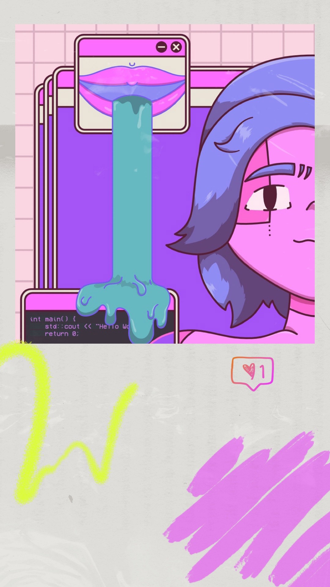
The First Illustration: Cyber Hacker
Cyber Hacker. This is the first vaporwave illustration I made since 2019 (?) so I had to regain my footing by browsing for inspirations. With this, I decided to make a "clean" illustration with less going on with its surroundings. I think I did a good job for my first illustration!
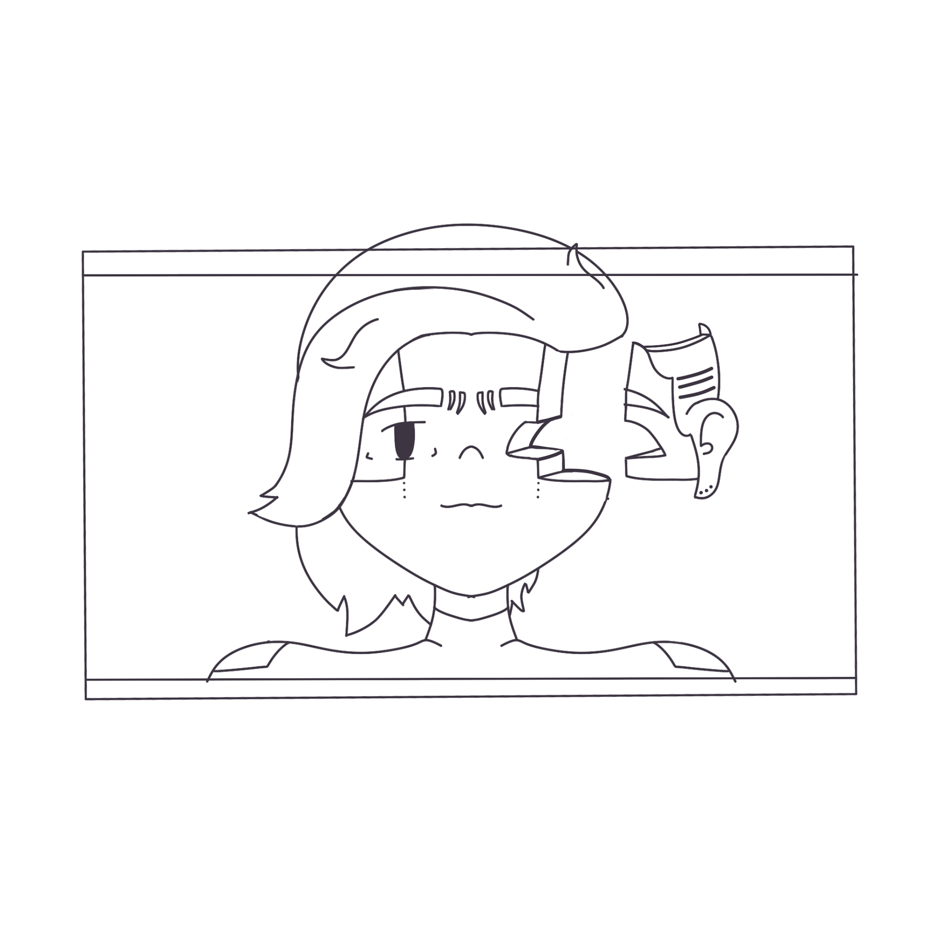
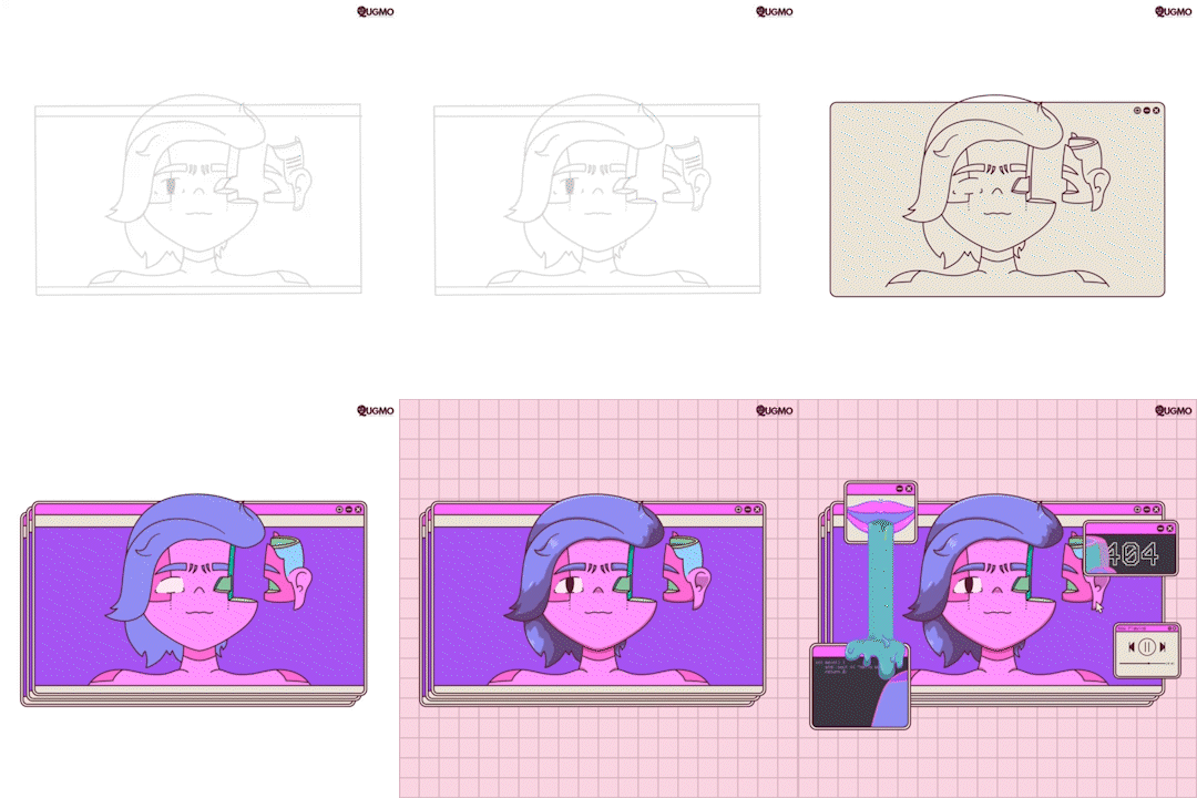
Sketch (left), and process video of the illustration (right)
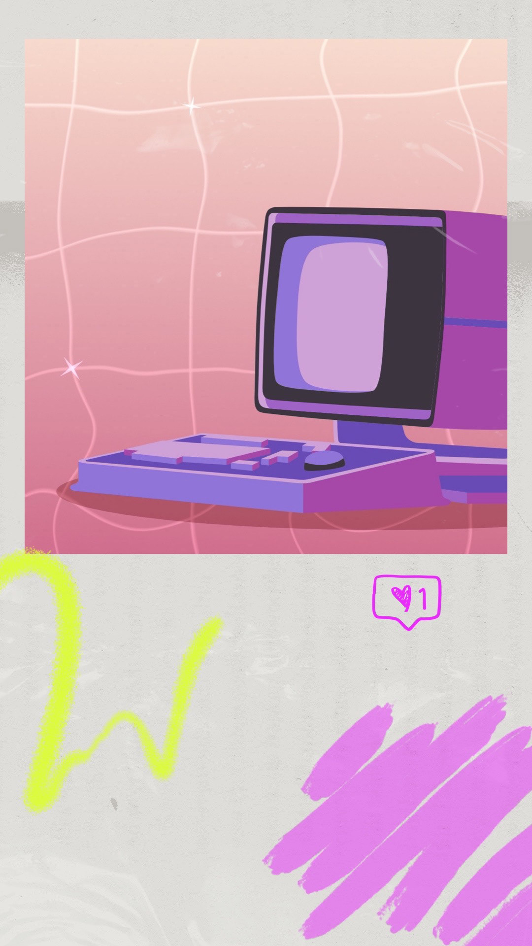
The Second Illustration: MDR Computer from Apple TV Plus' Severance
MDR Computer from Apple TV Plus' Severance. For this artwork, I actually wanted to try something new--go lineless! However, I was struck with a problem: what should I make? After scouring the net for ideas, I fortunately stumbled upon various vaporwave illustrations that depicted old-time devices. And then, it hit me--Severance. It was the perfect one for me for 2 reasons: (1) I am obsessed with the show and would do anything to talk/reference it, and (2) the MDR computer is a very interesting device.


The illustration with a Lumon-inspired watermark (left), and with a normal watermark (right)
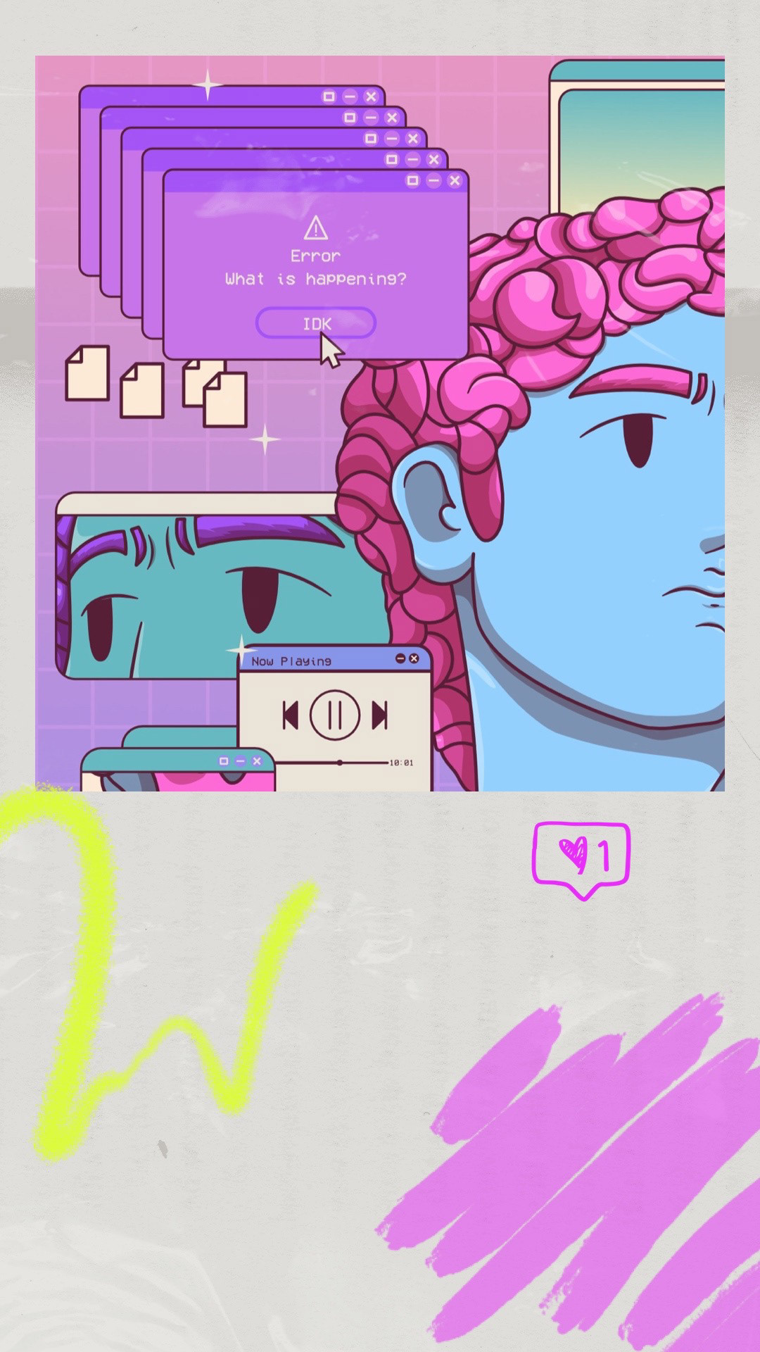
The Final Illustration: David
David. I think not doing an vaporwave illustration series that involved the bust of a renowned statue is just blasphemous. So, I just had to make it! One of my older vaporwave illustrations involved a "marble Medusa" but this time, I wanted to use something more traditional and noteworthy--David by Michelangelo. While my first illustration was a bit "cleaner," I wanted this one to be more "cluttered." This was such a challenging experience (and a kinda lengthy one) as I had to make apt objects that would fill up the screen while not taking the focus from the bust. Fortunately, I think I did well!
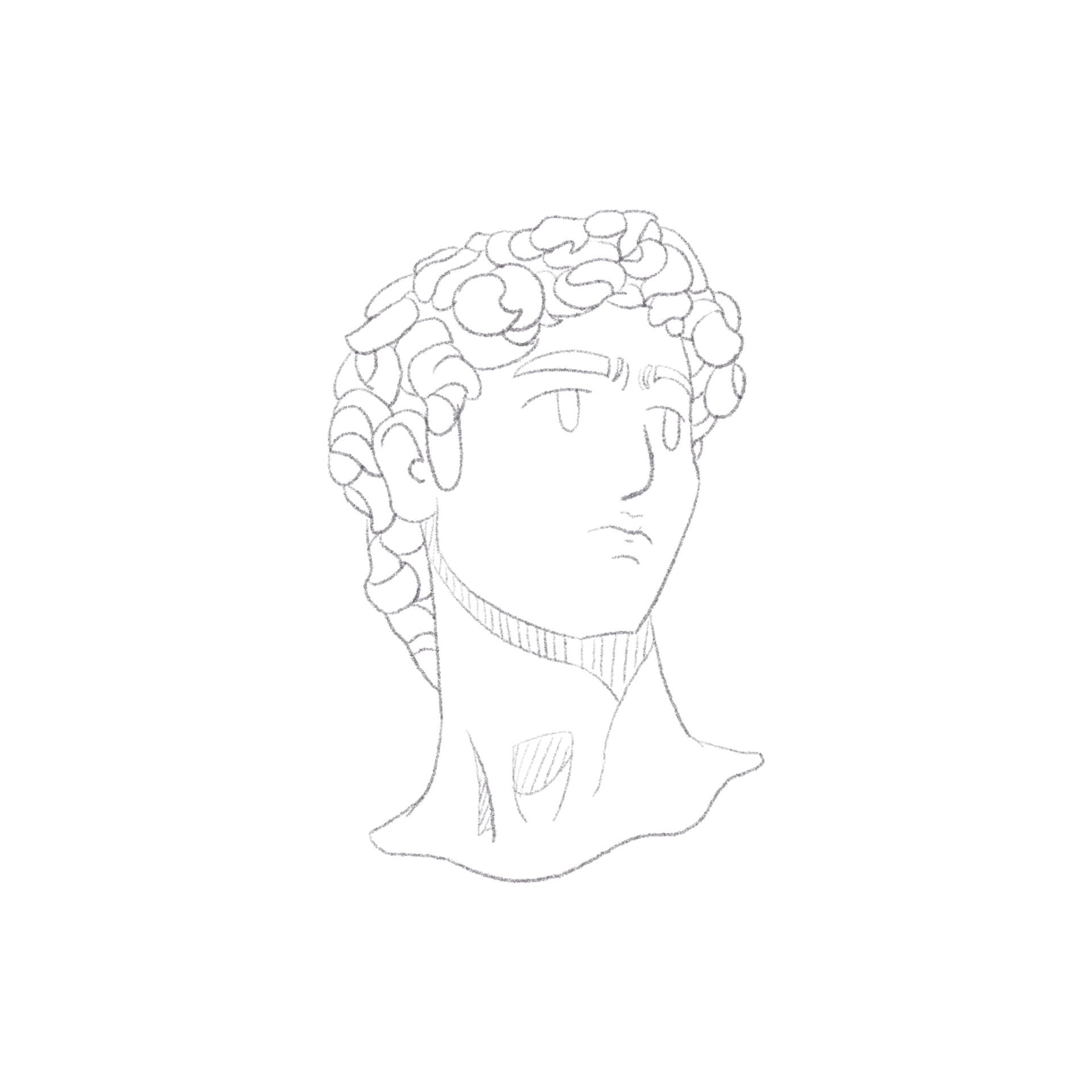
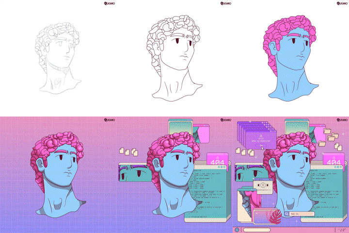
Sketch (left), and process video of the illustration (right)
The Promotional Pictures
This is perhaps my favorite series of illustrations out of the 4 aesthetics I've tackled. I feel like I've learned more about what clicks for me artistically--and the vaporwave aesthetics just does it for me.
📼
We've reached the end of the Retro Series! I am so glad that I challenged myself with this series as I gained a newfound appreciation towards the different aesthetics of the past eras, and learned a lot about myself and my capability as an artist. I'm still gonna be making more "retro" art and would definitely be revisiting some styles more than the other ones *cough* vaporwave and memphis *cough*.
📼
If you've been with me in this journey from start to finish, then I am so thankful for you! If you're from the future and missed out on how everything unfolded, don't worry! I still have lots of projects in store, ranging from videos to digital illustrations, so keep an eye out for those on my socials, as there will be exclusive content from there! Perhaps I could give a hint or two for what I am brewing: (1) moving drawings! and (2) landscape.
📼
Again, thank you so much for checking out the Retro Series! Don't forget to follow me on my socials for updates! ✨
